Interior design trends for 2019
A new year brings new fashions in interior design – and those thinking about carrying work on their homes might like consider the latest looks.
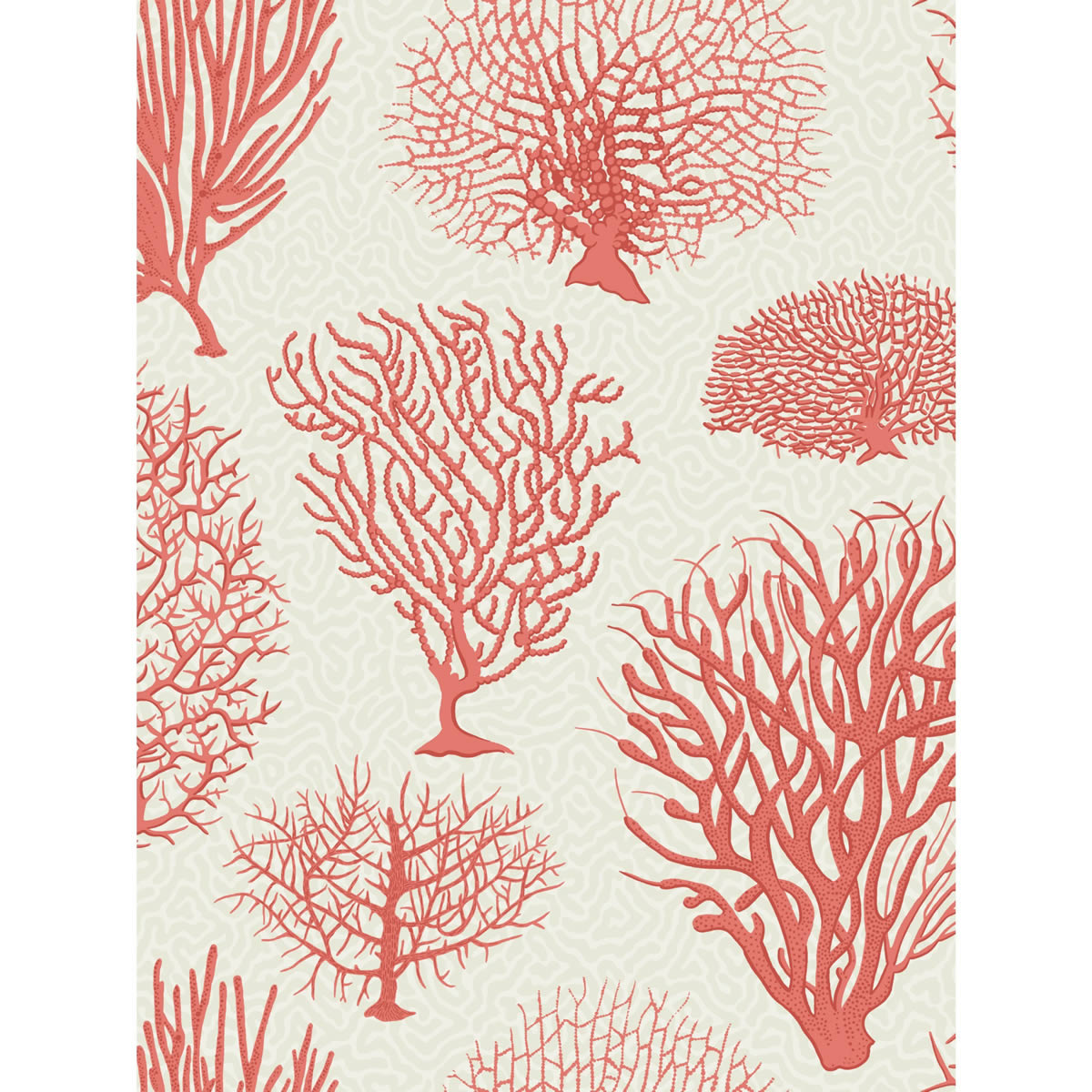
Pantone, provider of professional colour standards for the design industry, is once again leading the way and has announced its shade of 2019 is living coral.
PANTONE 16-1546 Living Coral is described as an animating, life-affirming shade of orange with a golden undertone.
Its use looks set to ripple out and encourage designers to look towards other marine life for inspiration, with coral shapes, scales and scallops also featuring in furniture, tiling and prints.
For 20 years, Pantone’s Colour of the Year has influenced product development and purchasing decisions in multiple industries.
These include fashion, home furnishings and industrial design, as well as product, packaging and graphic design.
The selection process requires thoughtful consideration and trend analysis. To arrive at the selection each year, experts at the colour institute comb the world looking for new influences.
This can include the entertainment industry and films in production, travelling art collections and new artists, fashion, all areas of design, popular travel destinations, as well as new lifestyles, playstyles and socio-economic conditions.
Influences may also stem from new technologies, materials, textures, and effects that impact colour, as well as relevant social media platforms and even up-coming sporting events that capture worldwide attention.
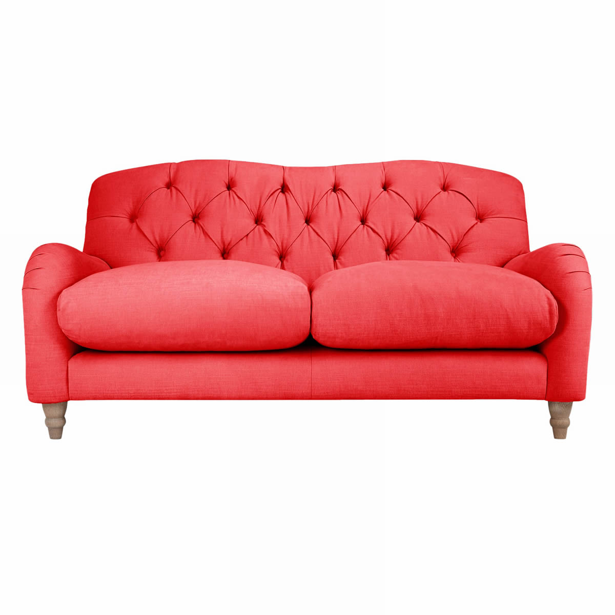
The institute suggests when used as a bold statement in settings and décor, living coral fosters immersive experiences, such as pop-up installations and interactive spaces, tied to a playful spirit.
As a colour linked to tactility and human connection, the shade creates a warm, comforting and nurturing feeling in the home when brought in through shag rugs, cosy blankets and lush upholsteries.
With its ebullient nature, it adds a dramatic splash of colour to any room setting, whether in decorative accessories, table top or a wall.
Laurie Pressman, vice president of the institute says: “Colour enhances and influences the way we experience life.
“As a shade that affirms life through a dual role of energising and nourishing, living coral reinforces how colours can embody our collective experience and reflect what is taking place in our global culture at a moment in time.”
Also this year, look out for more use of dark kitchens, concrete bathrooms, brass taps, star patterns, fringes and stone-washed fabrics.
Tropical prints, abstract patterns and 20th century furniture design are likely to retain their popularity.
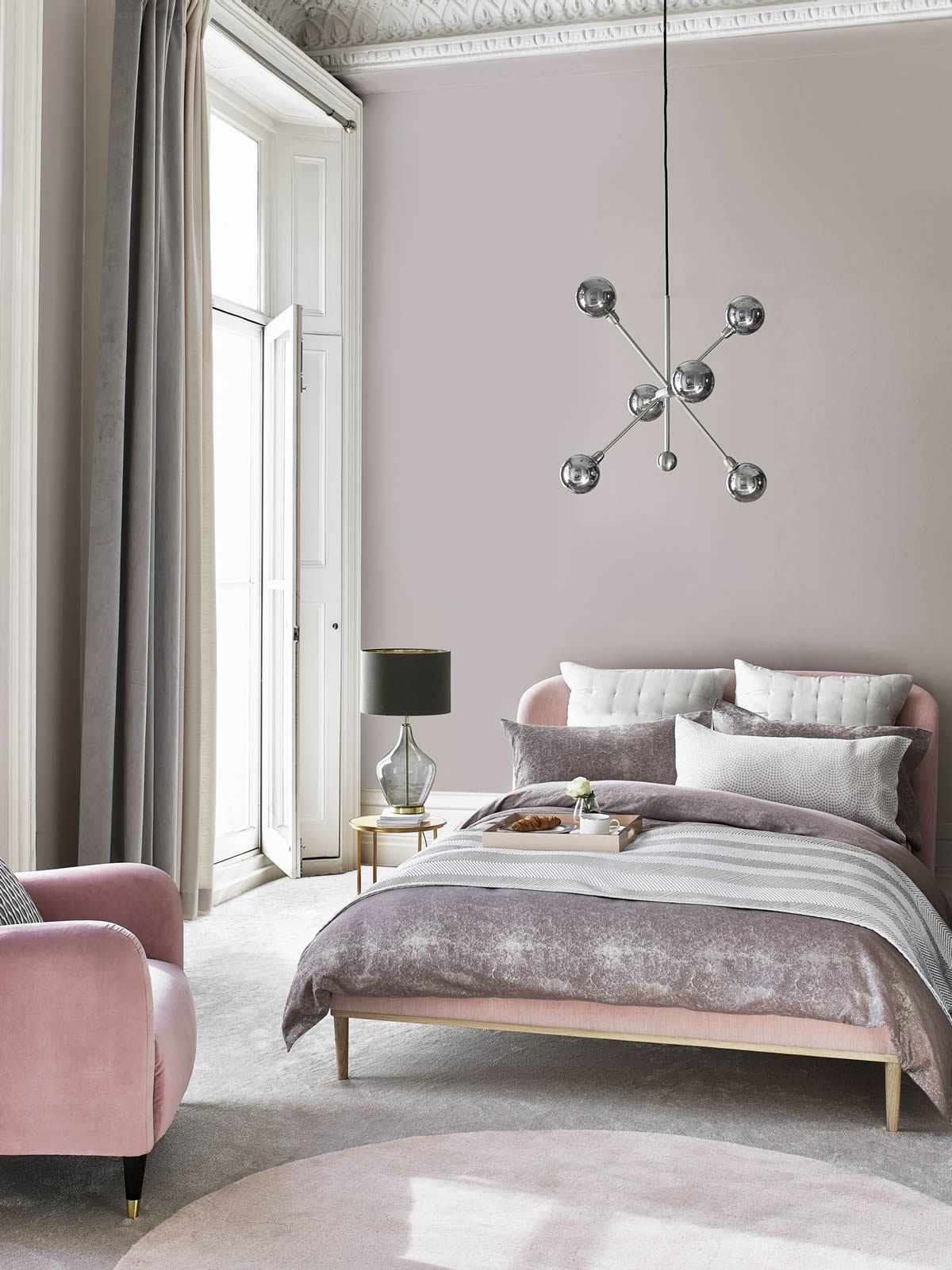
Backdrop colours will remain neutral and earthy in tone, moving towards spiced honey and caramel shades in some places.
Images are of John Lewis products.